SixStar
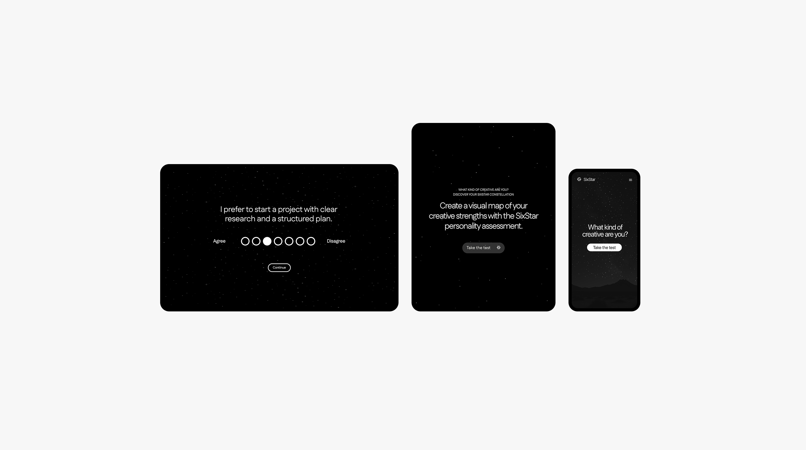
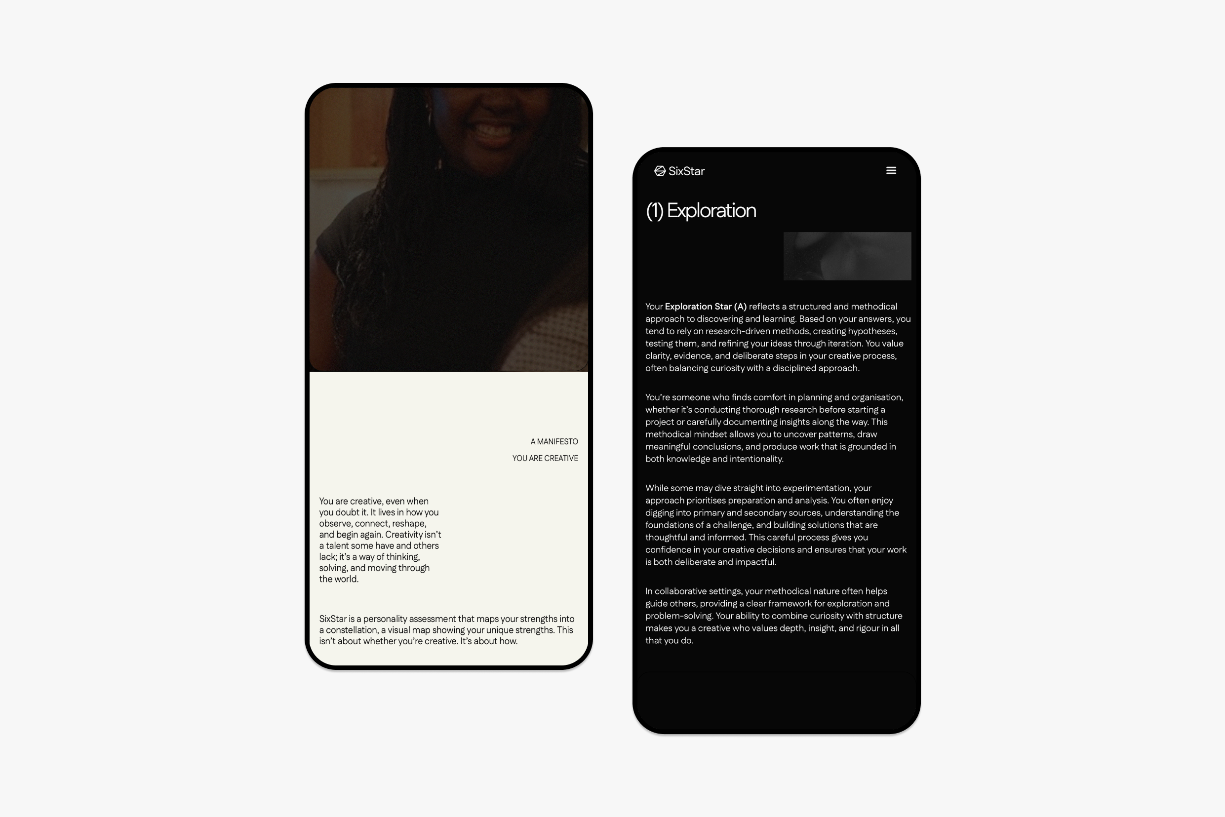
The web-based personality quiz designed to help emerging creatives better understand their unique design tendencies. Rather than assigning users a fixed label, the quiz places them along a spectrum of design traits, resulting in a constellation that visually represents their creative identity.
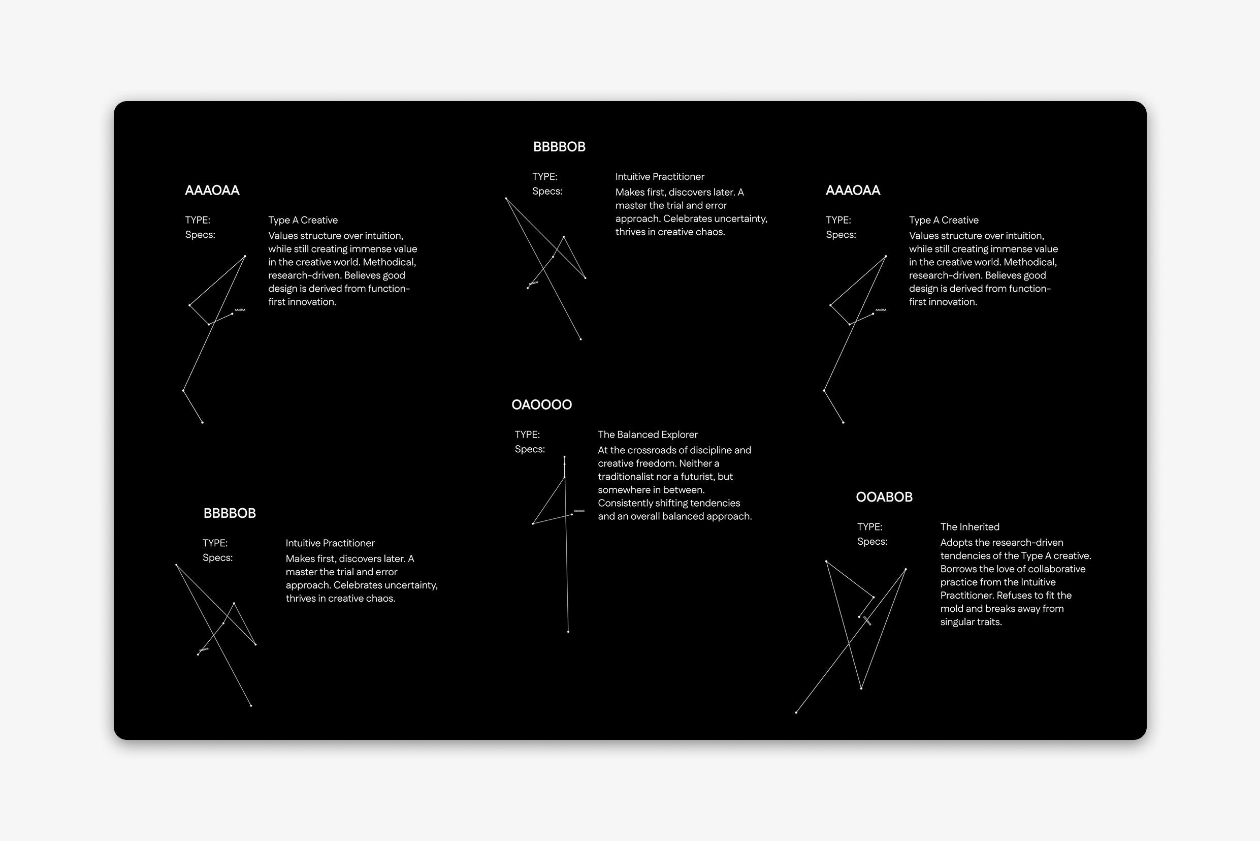
SixStar: The personality assessment built for creative practice.
The problem
Personality tools like 16Personalities or Adobe's My Creative Type are everywhere in creative education, but they tend to flatten people into fixed types. The concept that existing personality tests often reduce creative identity to a single archetype is well documented (Stein & Swan, 2019), and for emerging creatives already anxious about finding their place in the industry, that flattening can do more harm than good. It offers a label, not language for growth.
I wanted to know: could a personality tool actually help creatives understand their tendencies, without locking them into an identity?
Research
I started with a literature review of personality profiling and its critiques, mapping the recurring failure points across competitors.
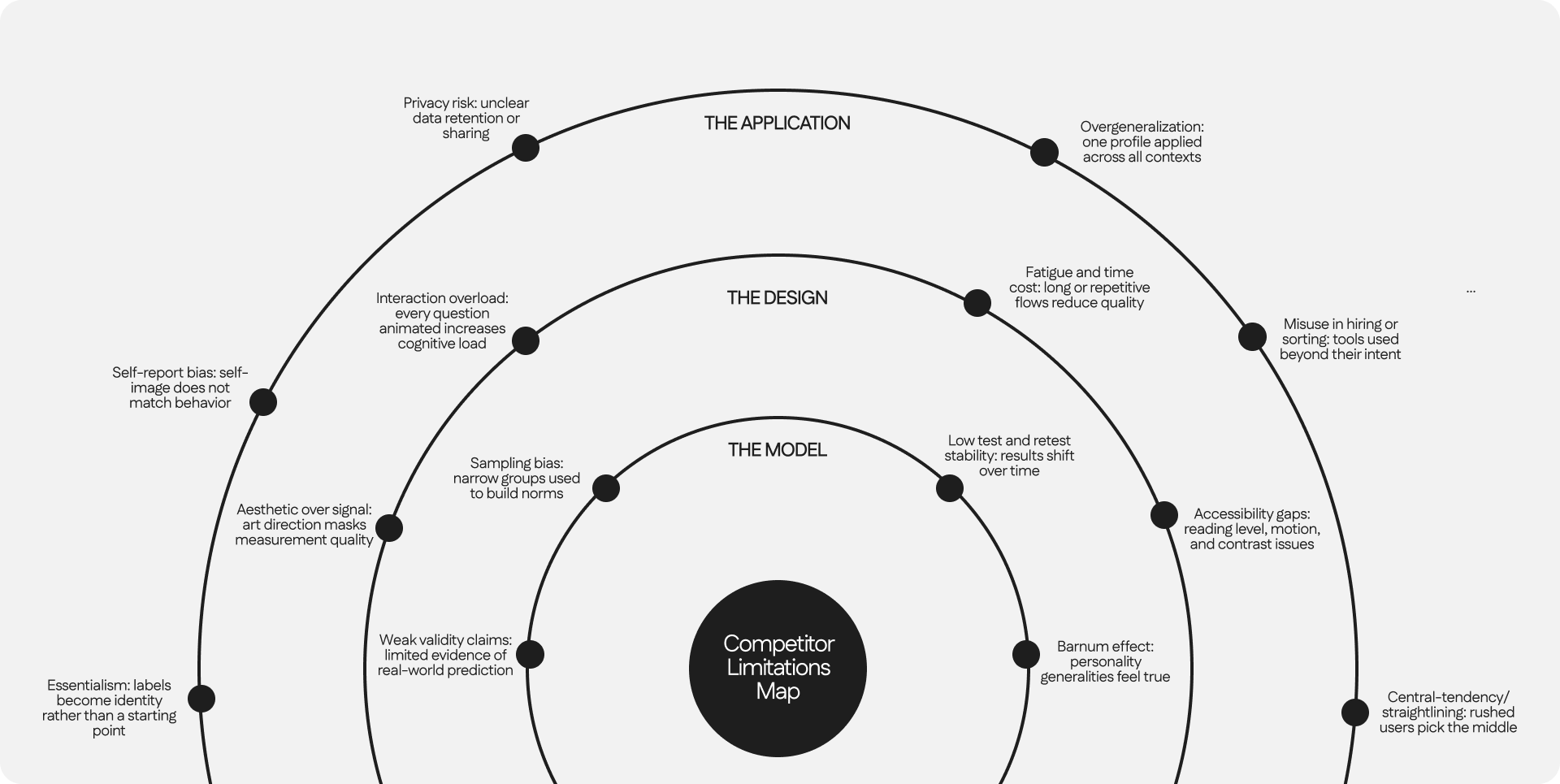
A few stood out as things I needed to design around from day one:
- Barnum effect: vague statements can feel personally true to almost anyone
- Essentialism: labels stop being a starting point and become an identity
- Interaction overload: overly animated interfaces can mask weak measurement underneath
Empathy mapping
Before designing anything, I mapped how my target users actually experience a typical online personality quiz, what they say, do, think, and feel when they take one.
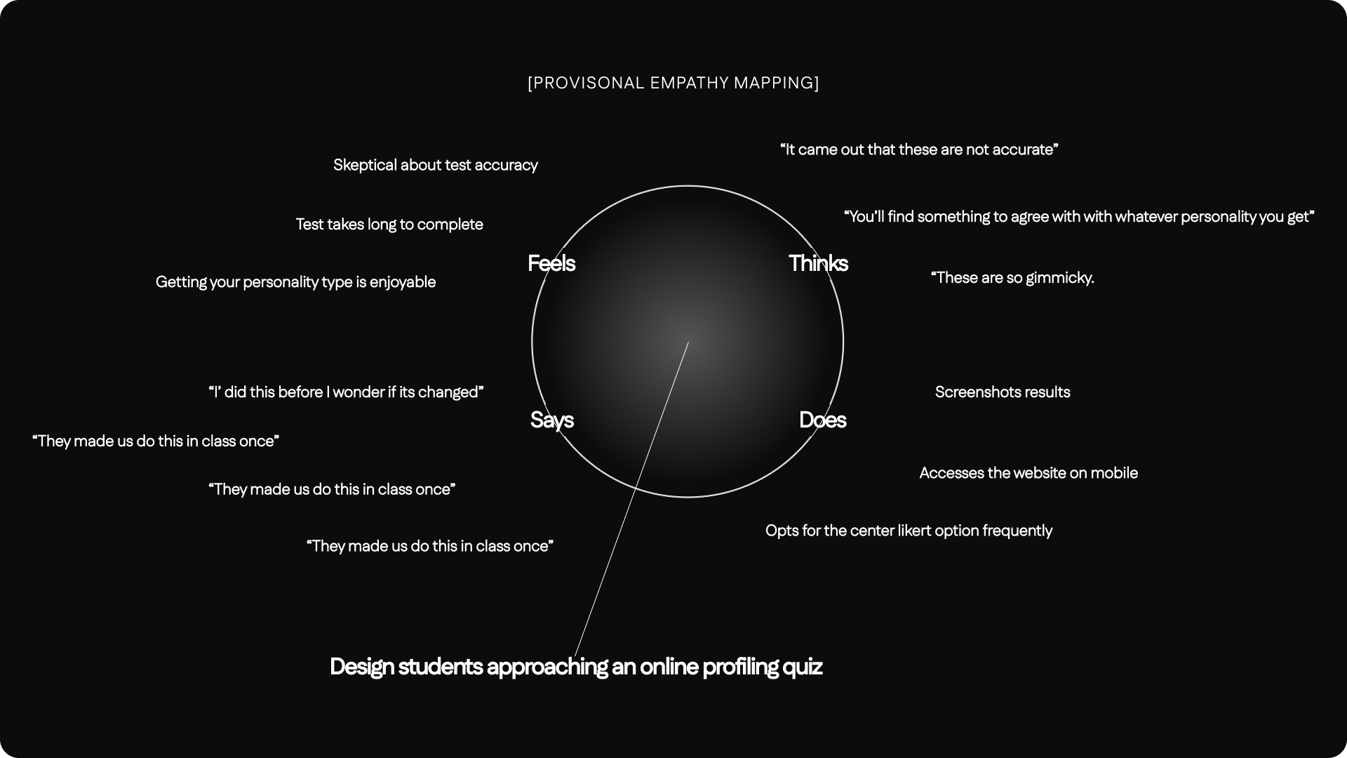
A few things stood out. People are often skeptical going in, yet still find the act of getting a personality type enjoyable. They default to the middle option on Likert scales when unsure. And a recurring association was personality testing as something done to them, passive, low-stakes, easy to dismiss. That tension between skepticism and enjoyment, and the desire to feel like an active participant rather than a passive subject, shaped almost everything that followed.
Defining the audience and the opportunity
I mapped the audience as a set of concentric circles rather than a single persona: creative students and recent graduates at the centre, with early-career creatives and seasoned designers sitting around them needing the same clarity for different reasons.


From there, three design principles shaped every decision after this point:
Communicate nuance. Treat creativity as a cluster of shifting tendencies, not a fixed type, so people can recognise themselves without feeling boxed in.
Visualise without over-claiming. Keep the output minimal and readable, frame it as a snapshot to reflect on, not a verdict about who someone is.
Build for creative practice specifically. Ground every question in real creative contexts, iteration, critique, collaboration, so the insight is usable in a portfolio or team conversation, not just a fun fact about yourself.
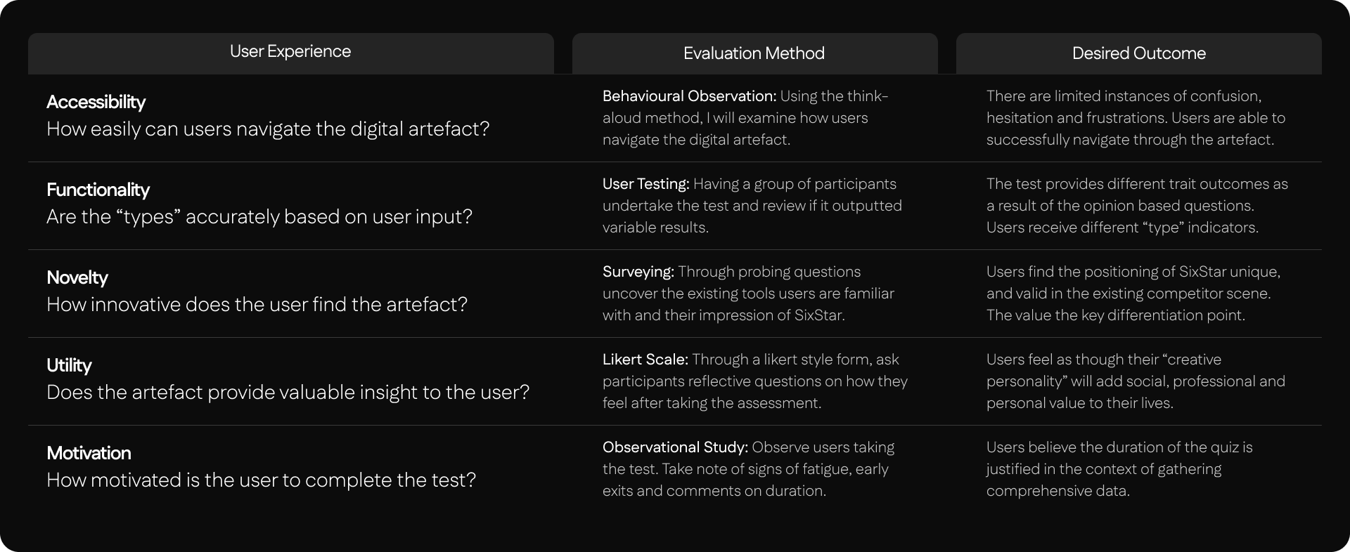
I also defined explicit success criteria before designing anything: accessibility, functionality, novelty, utility, and motivation, each with its own evaluation method.
The six traits
Synthesising the research, I landed on six traits that together discover a creative's working style:
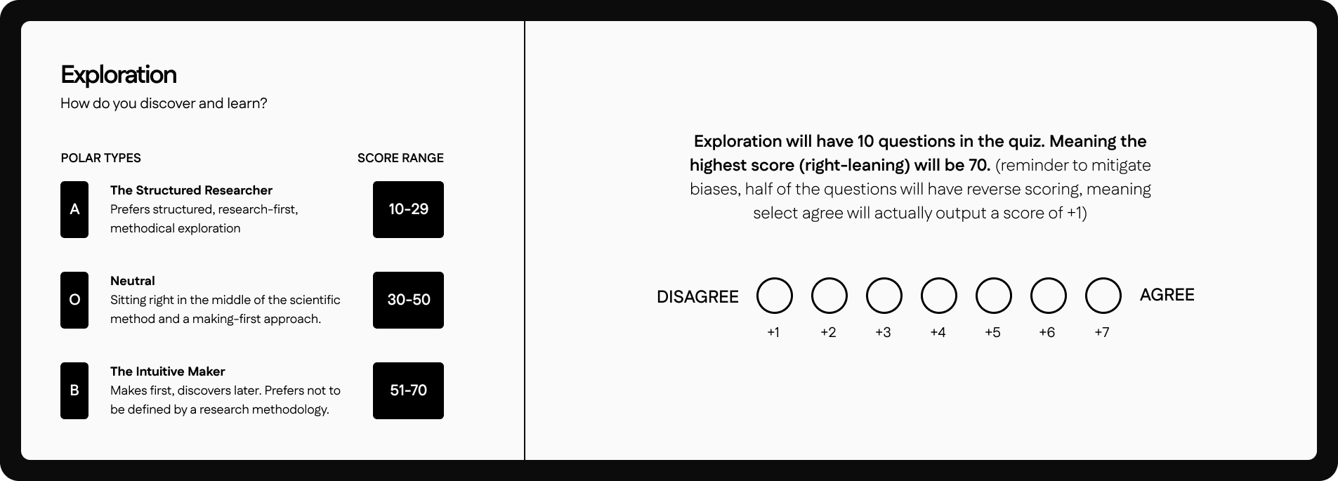
- Exploration: How do you discover and learn?
- Motivation: Why do you create?
- Adaptation: How do you respond to change?
- Energy: How do you recharge your creativity?
- Ambition: How do you measure success?
- Position: What role do you play in a team?
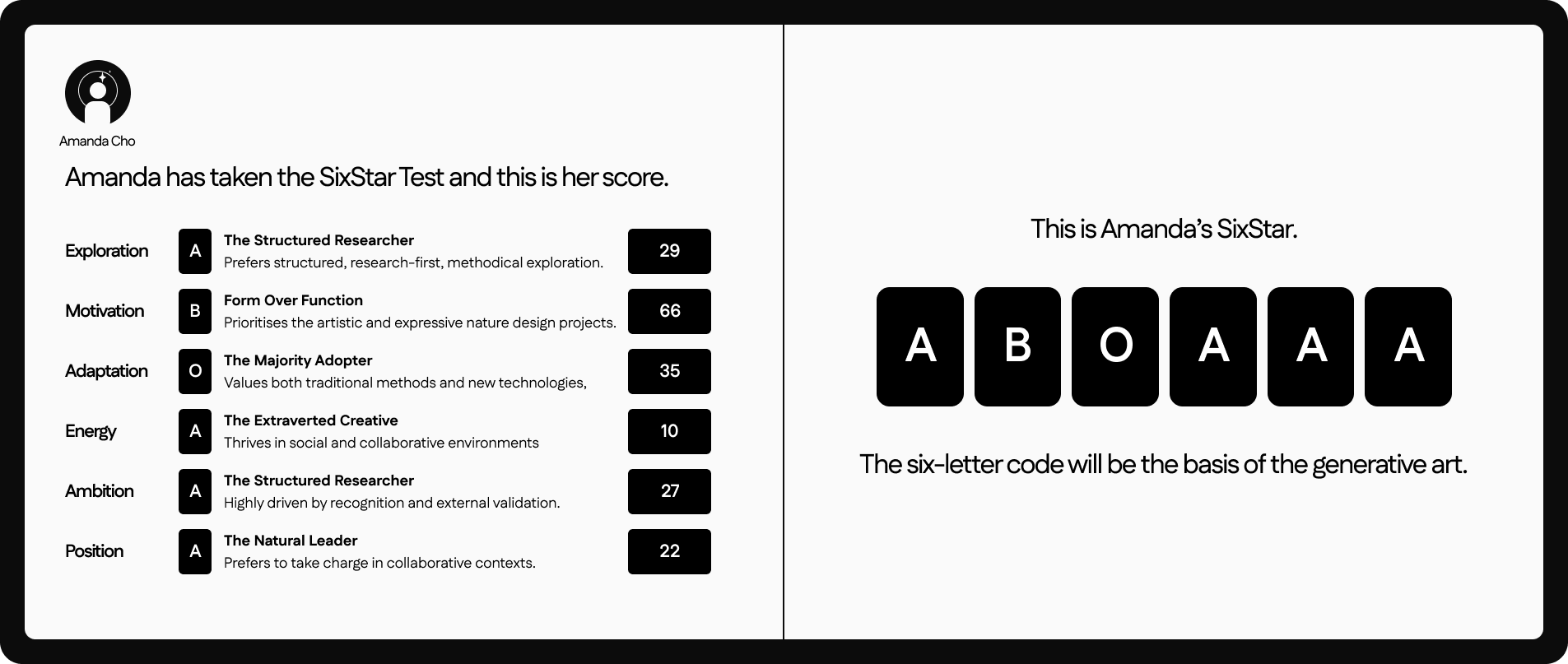
Each trait sits on its own spectrum rather than a binary, with three named zones. The result isn't one label, it's a six-letter code describing where someone sits across all six.
Scoring logic
Each trait is measured through ten Likert-scale statements, scored from 1-7. I deliberately departed from the standard 5-point Likert in two ways, both addressing known biases in scale design:
No labelled midpoints. Only the two poles are labelled. Defined category labels at every point can introduce false equivalence between intervals that aren't actually equal in size for respondents (Cohen et al., 2017).
Reverse-coded statements. Half the questions in each trait are phrased as the inverse, so agreeing doesn't always push the score the same direction. This counters the tendency for respondents to lean toward whichever side feels "positive" (Hartley & Betts, 2010), and makes straight-lining far less likely.
From code to constellation
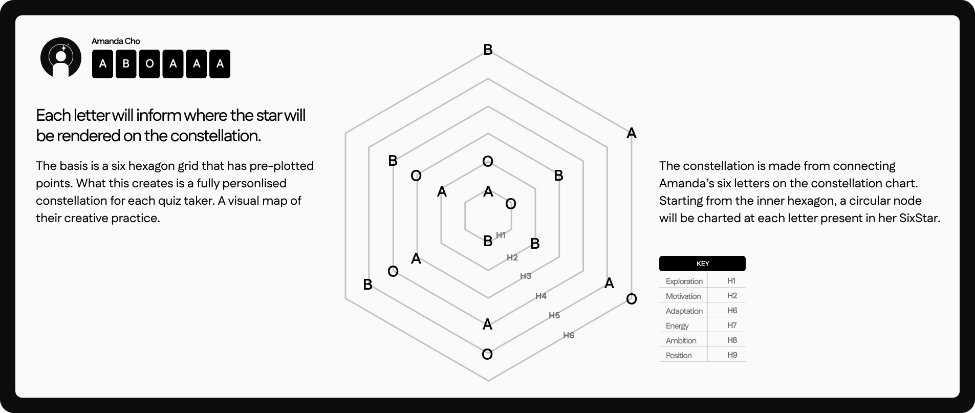
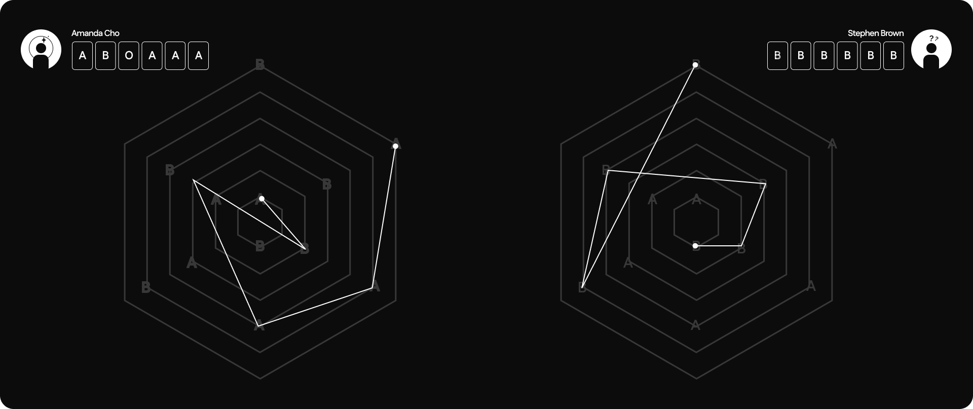
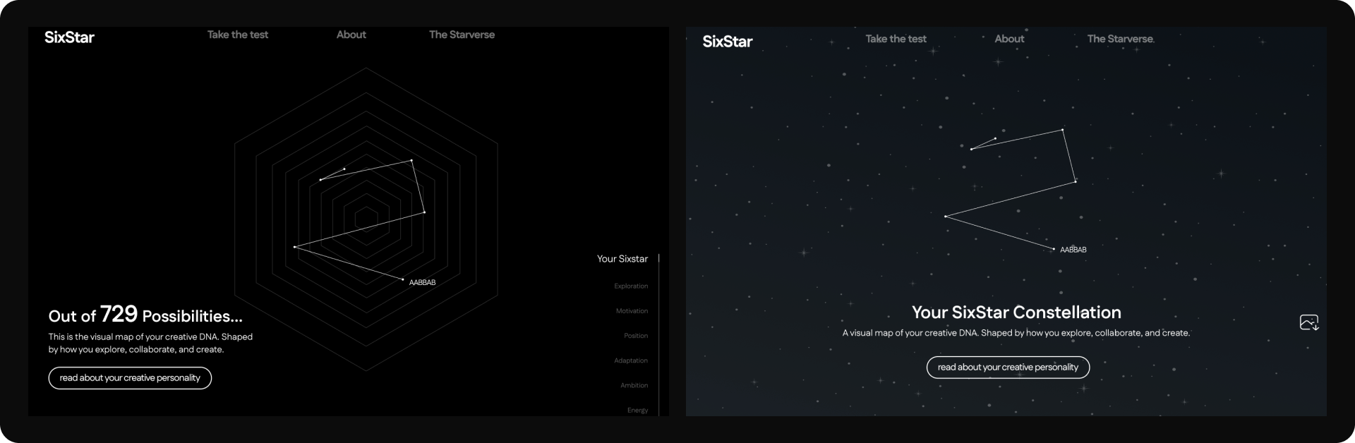
The six-letter code maps onto a generative art system, built with p5.js, that plots a personalised constellation for each result. A six-point hexagonal grid has pre-plotted nodes for each trait. Each letter determines where their point lands on that trait's axis, and connecting all six points draws a unique shape, out of 729 possible combinations.
Designing and testing
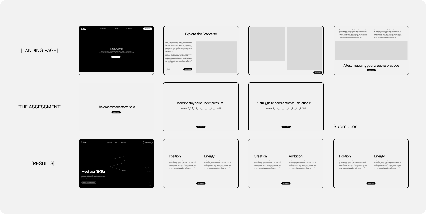
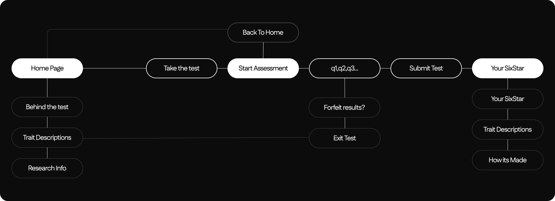
I moved through low-fidelity wireframes first, mapping the core flow: landing page → assessment → results.
For the results page specifically, I tested two directions with users: a constellation-style visual map versus a more conventional layout. Users preferred the version with center-justified text and the starry background, they found it felt relevant to the concept rather than decorative.
Accessibility and ethics, by design
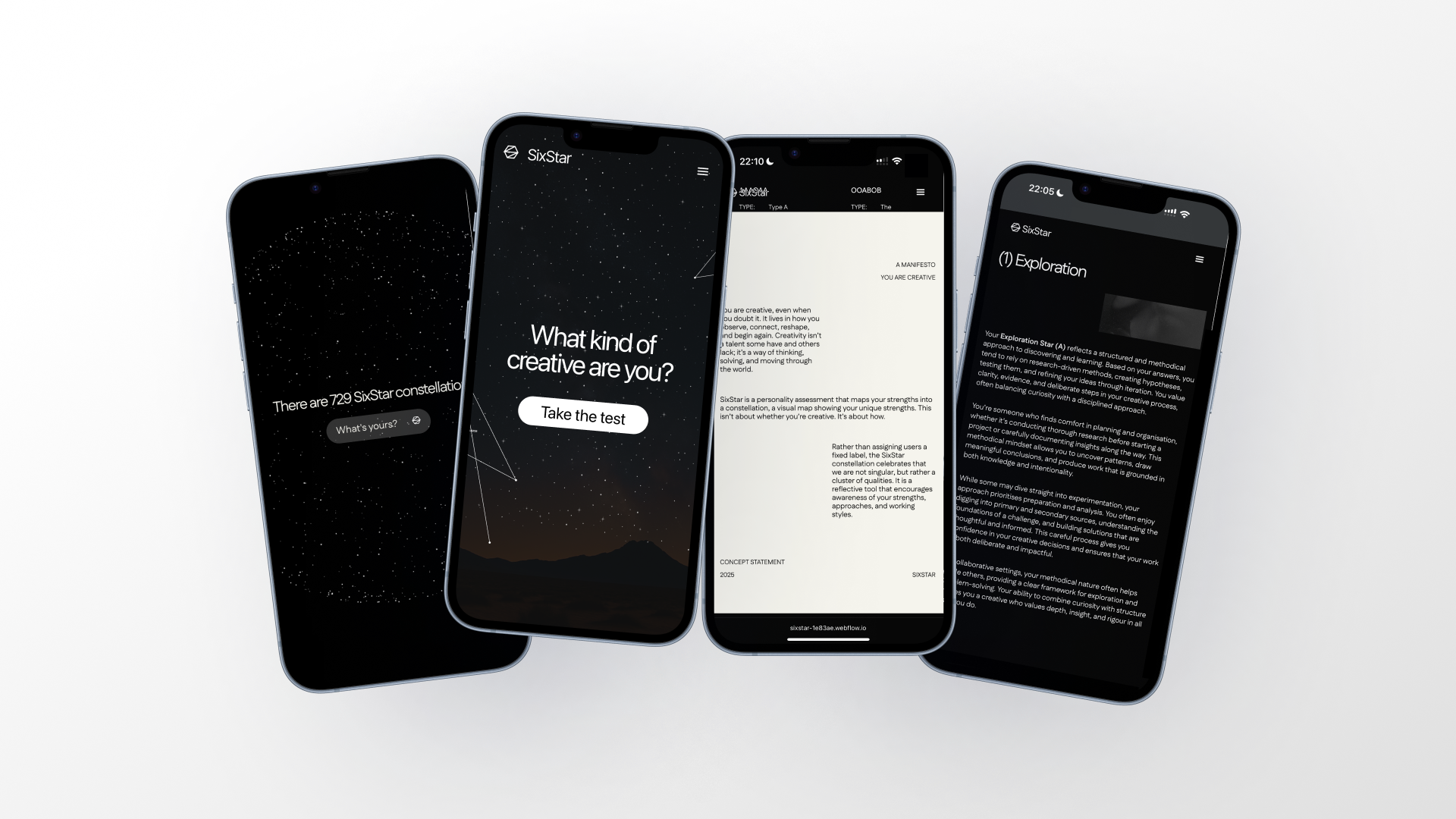
- Plain language and short sentences throughout
- Minimal animation, with motion reduction respected
- Results framed as open-ended prompts, never fixed labels or rankings
- Fully anonymous, aggregate reporting, with clear consent
- Brand voice guidelines that explicitly avoid definitive claims
What I'd take into a team setting
This project taught me how to design a measurement system I could actually defend, the scoring logic decisions came directly from research into scale bias, not personal preference. It also taught me to treat ethical and accessibility considerations as inputs to the brief, not a checklist applied at the end.
.gif)

