
Design directions: how AI startups are shaping their sites in 2025
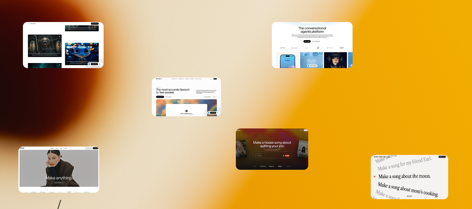
From bold type to generous white space and content-heavy layouts, the newest AI brands are rewriting web design rules. Let’s explore how RunwayML, ElevenLabs, and Suno AI are using design to reflect cutting-edge technology, and what you can take from their websites for your own brand.
1. RunwayML
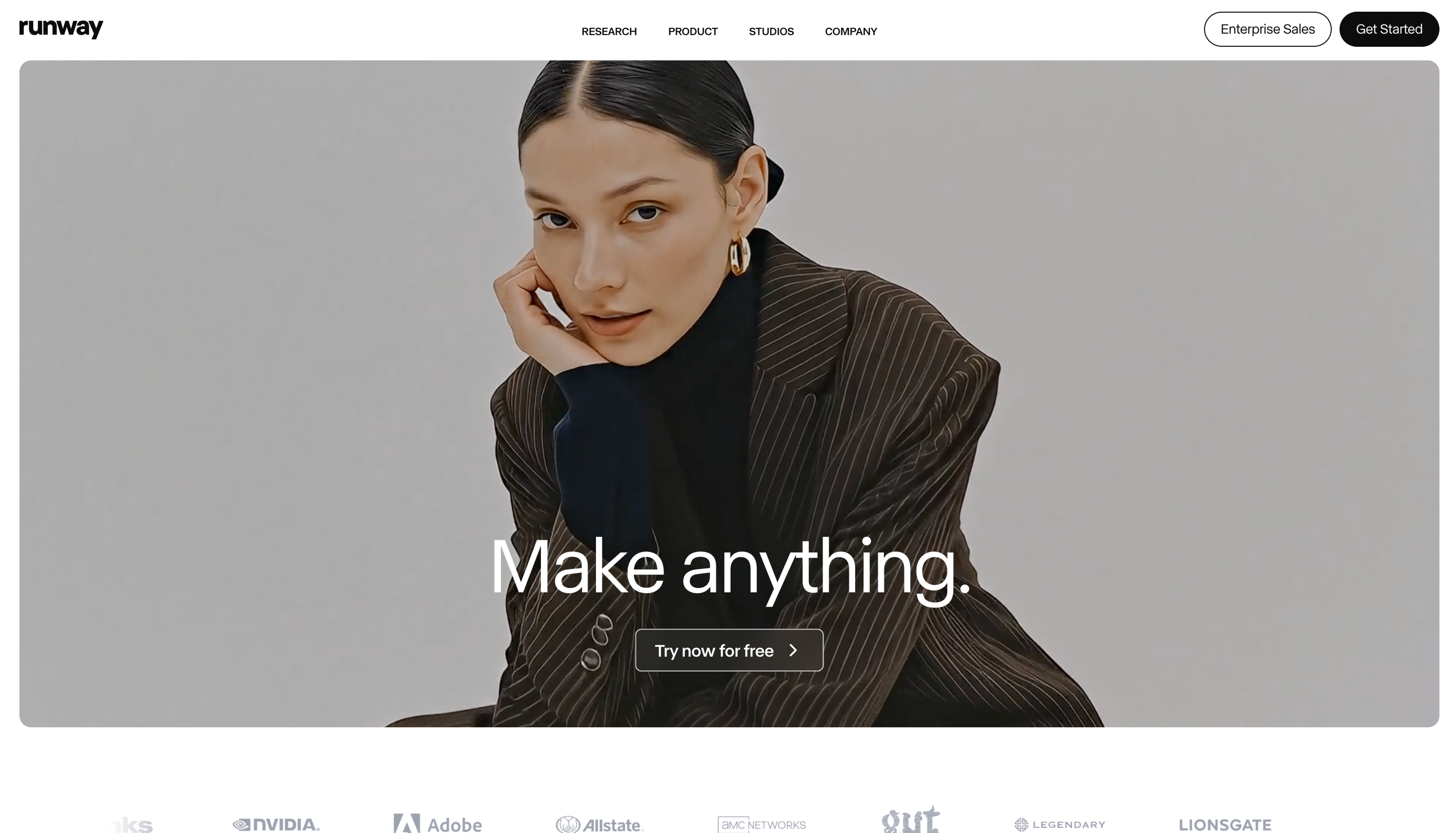
The RunwayML site leads with large sans-serif typography, minimal distractions, and a content-first presentation that emphasizes what the product does (“Generate images and video with AI”). Their hero text is super clean and scaled up, while generous whitespace allows visuals to breathe and keeps the layout from feeling crowded. The imagery directly reflects the product’s capabilities, showing off video and image generation in context, and the overall color palette stays simple, letting the content carry the mood.
For studios, the takeaway is clear: if you’re showcasing brand identity or web presence, lead with a strong message in large typography so visitors immediately understand what you do. Let the visuals and whitespace communicate sophistication and clarity, and avoid clutter that could dilute your story.
2. ElevenLabs
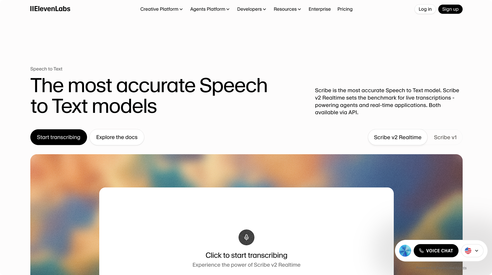
ElevenLabs positions itself as a voice-AI and audio tech brand with global ambition. Their website uses crisp typography, high-contrast text, and purposeful layouts to communicate clarity and innovation. Headings are bold and prominent, subheadings are clear, and body text is kept minimal, giving the content a confident hierarchy. The backgrounds remain clean, emphasizing the copy and messaging, while the interface feels simple and approachable, reflecting the idea that advanced technology can be understandable and human.
For your own studio work, this demonstrates the power of typography as a tool: strong headings paired with simple body copy signal authority and clarity. Keeping visual distractions to a minimum ensures your message is front and center, creating a professional and thoughtful impression for your visitors.
3. Suno AI
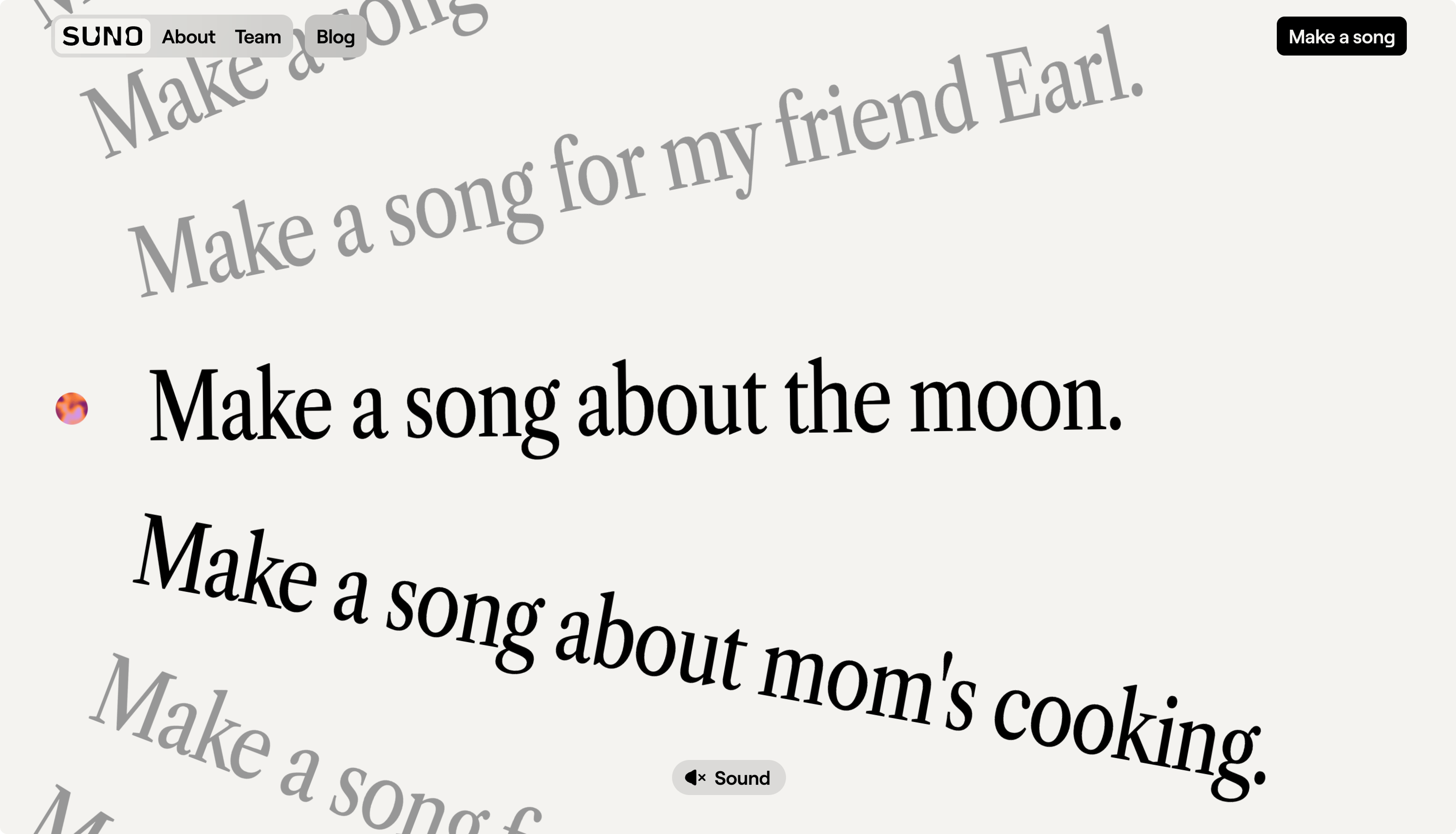
Suno is shaking up the AI-music website space with a playful, colorful, and highly interactive design. Their site rethinks what a “clean” AI website can be by combining vibrant colors, subtle animations, and creative layouts that feel dynamic without feeling chaotic. Movement and micro-interactions bring energy to the experience, while bold pops of color contrast against clean sans-serif typography for readability. The layout breaks the standard grid in interesting ways, keeping the user engaged while still making content accessible and clear.
For studios, Suno shows how you can balance structure with playfulness. Adding color, motion, and interactive elements to a traditionally clean framework can create a more memorable experience, conveying creativity and modernity without compromising clarity or professionalism.
Common design trends among these AI sites
Across RunwayML, ElevenLabs, and Suno AI, several trends emerge. Large, clean sans-serif typography dominates, helping messages land immediately. Pages are content-heavy but remain uncluttered, using whitespace to let visuals and text breathe. High contrast and clear messaging ensure visitors know what the brand offers from the first glance. Finally, visual storytelling , whether through motion, imagery, or layout experimentation, is used to convey product personality and value rather than just listing features.
Final thoughts
For your own website, especially if your studio is offering brand identity, web design, or creative direction, there are clear lessons here. Start with a strong headline in bold typography, use a clean grid with generous spacing, and let content shine without unnecessary decoration. Visual storytelling, motion, and color can inject personality and energy, but should always complement the structure and clarity of your message. Balancing creativity with readability ensures your site feels both modern and professional, leaving a lasting impression on your audience.
More from the studio
Explore our latest thinking on design and strategy


Have a project in mind?
Fill out the form and we'll be in touch within 72 hours
